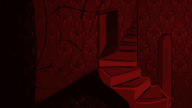
After receiving the feedback from the OGR and numerous conversations with my tutor, my thumbnails have started to go in a new direction.
2 thumbnails have changed to the interior of Genuine Magic from The Magic Shop and the bedroom featured in The Red Room.
Below are a few more recent thumbnails for The Magic Shop and the staircase for the stairway in The Red Room
 |
| 45 |
 |
| 46 |
 |
| 47 |
 |
| 48 |
 |
| 49 |

Okay! So these are about a 1000 times more expressive, more idiosyncratic, more 'animation universe' already. Now, time for a bit more input then - I want you to go and actually collect some real world reference; so, go find a ventriloquist dummy image, turn it into a silhouette, and layer it into your scene; there's still some lazy thinking here (in production design terms) being expressed by your drawings - i.e., generic 'rounded' doorways, for example; go map some real word reference onto your world. Check out too the use of gobos in theatre design for expressionistic lighting effects - and also, check out 'film noir' in terms of lighting and angularity - and shot composition and ratios of light to dark spaces. I think you need to lose some of your 'bubbly' drawing style (everything a bit round cornered and squishy) and go for something more clean-lined and confident; for an example of a stronger, more expressionistic look, go on-line and get a good image of a real-world interior with strong lighting etc. take into photoshop, and then use the 'cutout' filter to convert that example image into something a bit more 'wood cut'stylee, as in:
ReplyDeletehttp://www.spaightwoodgalleries.com/Media/Schmidt_Rottluff/Schmidt_Rott_Girl_Braids2.jpg
http://www.inter-asia.org/journal/correlative_photo/vol7/no3/ZHOU_05.jpg
http://www.wilsey.net/image/woodcut.gif
http://www.humanistperspectives.org/issue153/images/ill-Shawn-woodcut1.jpg
My point is you've just taken a really important 'style' step in these thumbnails, but I'm encouraging you to take a few more...