
Showing posts with label Film Reviews. Show all posts
Showing posts with label Film Reviews. Show all posts
Tuesday, 19 February 2013

Saturday, 2 February 2013
Tuesday, 15 January 2013
Thursday, 10 January 2013
Monday, 26 November 2012
Tuesday, 13 November 2012
Mise en Scene FIlm Review: Edward Scissorhands
Edward Scissorhands (1990) was written and directed by Tim Burton and is based on the thoughts of disfigurement and creativity with ties into Burtons fascination with Frankenstein.
One of the more noticeable aspects of Edward Scissorhands is the set design and the unique ways in which two contradicting worlds come together so well 'The apparently gloomy castle is in fact a shelter from the seemingly happy outside world, which is in fact, much darker and sinister underneath its bright colours.' (Esteryn, 2012) As Esteryn points out, the beginning of the film shows Edward in his 'birth' house which is essentially like your typical creepy house on a hill; over-grown, unloved, lack of colour and a lack of life stand out from the house. This odd house on a hill is placed at the end of a typical 60's American suburbia where everything is symmetrical and perfectly pastel. However, once the story unfolds, the audience realises that it's not the creepy house on the hill that they should be scared or afraid of, it's the 'normality' in which the Suburban housewives live in.
Edward Scissorhands came from a simple sketch and personal influences from Tim Burton were brought in to create a truly interesting and moving film, ' this personal effort, perhaps the cinema’s most enchanting parable about the misunderstood and alienated artist.' (Larsen, 2012) There are many different interpretations running through this film, but the most noticeable one is the idea of alienated artists and the ridicule for not being the stereotype of 'normal' which is uncovered in the film to represent something horrible and untrusting when something of 'unique' stature appears in their world.
'Edward connected with audiences who could relate to his loneliness and desire to be accepted into a larger community, but who was ultimately cast off because of his freakish, confrontational otherness. Burton's sketch beautifully captures the beauty and emotion of Edward's weirdness.' (Ciampaglia, 2009) Ciampaglia's quote depicts the characteristics and the personality portrayed in the sketch and the way in which Johnny Depp then portrays the character in the film.
Larsen. In: http://www.larsenonfilm.com [online] At: http://www.larsenonfilm.com/index.php?Search=Edward%20Scissorhands%20Winston&AllWords=on (Accessed on: 13/11/12)
Dante Ciampaglia. In: http://www.forbes.com [online] At: http://www.forbes.com/2009/11/24/tim-burton-drawings-moma-opinions-art-review-dante-a-ciampaglia_slide_6.html (Accessed on: 13/11/12)
One of the more noticeable aspects of Edward Scissorhands is the set design and the unique ways in which two contradicting worlds come together so well 'The apparently gloomy castle is in fact a shelter from the seemingly happy outside world, which is in fact, much darker and sinister underneath its bright colours.' (Esteryn, 2012) As Esteryn points out, the beginning of the film shows Edward in his 'birth' house which is essentially like your typical creepy house on a hill; over-grown, unloved, lack of colour and a lack of life stand out from the house. This odd house on a hill is placed at the end of a typical 60's American suburbia where everything is symmetrical and perfectly pastel. However, once the story unfolds, the audience realises that it's not the creepy house on the hill that they should be scared or afraid of, it's the 'normality' in which the Suburban housewives live in.
 |
| Figure 1 |
Figure 1 is a hot from early on in the film and shows the design differences between the two worlds that Edward lives in. 'The movie takes place in an entirely artificial world, where a haunting Gothic castle crouches on a mountaintop high above a storybook suburb, a goofy sitcom neighbourhood where all of the houses are shades of pastels and all of the inhabitants seem to be emotional clones of the Jetsons' (Ebert, 2003) Roger Ebert points out that the suburban neighbourhood is viewed upon as a goofy sitcom and very unrealistic, which ties in with Burtons visual style throughout the film, each aspect of Edward Scissorhands is somewhat an exaggerated truth of the real world but not unbelievably so.
Edwards house, the haunting Gothic castle, used its size to help create the feeling that Edward was monstrous and an abnormality from the pastel life of the suburb. The sizing of the castle in relation to Edward made him almost look like a small creature lost in the huge space of the house that was warning people off with its structure and appearance.
Figure 2 shows one of the characters inside the castle, it demonstrates the way in which the set almost engulfs the character by its size and makes them seem small and exposed in the empty spaces.
 |
| Figure 2 |
 |
| Figure 3 |
Bibliography
Images
Figure 1 - http://www.alicia-logic.com/capsimages01/esc_014Neighborhood.jpg
Figure 2 - http://ia.media-imdb.com/images/M/MV5BMTUxMjA1NDgyM15BMl5BanBnXkFtZTYwNjA0NzY3._V1._SX475_SY311_.jpg
Figure 3 - http://25.media.tumblr.com/tumblr_ktacx0WLaX1qa214go1_400.jpg
Quotes
Alias Esteryn. In: http://coco.raceme.org [online] At: http://coco.raceme.org/films/edwardscissorhands/review.php (Accessed on: 13/11/12)
Alias Esteryn. In: http://coco.raceme.org [online] At: http://coco.raceme.org/films/edwardscissorhands/review.php (Accessed on: 13/11/12)
Roger Ebert. In: http://rogerebert.suntimes.com [online] At: http://rogerebert.suntimes.com/apps/pbcs.dll/article?AID=/19901214/REVIEWS/12140301 (Accessed on: 13/11/12)
Larsen. In: http://www.larsenonfilm.com [online] At: http://www.larsenonfilm.com/index.php?Search=Edward%20Scissorhands%20Winston&AllWords=on (Accessed on: 13/11/12)
Dante Ciampaglia. In: http://www.forbes.com [online] At: http://www.forbes.com/2009/11/24/tim-burton-drawings-moma-opinions-art-review-dante-a-ciampaglia_slide_6.html (Accessed on: 13/11/12)
Monday, 12 November 2012
Mise en Scene Film Review: La Belle et la Bete
La Belle et la Bete, or more commonly known as Beauty and the Beast (1946), was filmed and directed by a French poet called Jean Cocteau, whose designer influences and diverse background can be seen throughout the film.
Throughout the film, there is the use of humans in place of real world artifacts, such as lamps, statues and candle holders. This gives the film both an eerie sense of people watching you, but also a very whimsical and theatrical feel that the artifacts are there to help you and serve you.
Figure 1 is a film still from the beginning of the film, featured in the image is the use of arms and hands as candle holders that move in time with the people in the set, which also gives the film a real-time feel to it. 'Cocteau's version is lushly, deliciously frightful, embellishing the basic fairy tale with a surreal, delicate eroticism of spying mirrors; of a magic castle with seeming peeping-tom eyes, all the better to satisfy ones every whim' (Johanson, 2002) As Maryann Johanson says, the film that Cocteua's created was not an ordinary fantasy romantic film that is portrayed in the Disney adaptation, but more of a dark and frightful version that is somewhat more believable to an adult audience; with the use of people as props, it lends the film a sense of eerie realism that draws in the viewers attention to the sets.
Another noticeable aspect of the film is the theatrical lighting that is used to emphasise the mood of a scene or help to enlarge or shrink some of the set to create more interesting spaces. A lot of the lighting throughout the film is based solely on the characters faces when they are thinking or talking, this is mostly to help the audience follow who is the main person in that scene and what the main focus is, if a scene has more to it then the lighting will change and expand to show more of the surroundings.
Figure 2 is a shot of Beauty looking into the magic mirror to see how her Father is. The lighting in this scene is focuses solely on Beauty and the mirror to show the main focus and point of this particular scene and to give all the attention to them rather than the background and the set.
'Beast's world is dreamily romantic, everything curve shaped and shadowy, the expressionist lighting just exquisite' (Lorefice, 2005) As Lorefice says, the lighting in the Beast's castle and world is done in a way to create a dream like ambiance to tie in with the story of the film and to create a much more thrilling effect on the audience when the characters first enter the castle.
Considering the date in which La Belle et la Bete came out, there is a lot of trick photography and effects that are used to help simulate a dream like world in the Beasts castle; Beauty seeming to glide through doors and skimming across floors, the necklace of pearls that turns into something horrible when the other sister touches it and the movements of objects within the castle that all have an airy and floaty feel about them all add to the effect of the castle and the way the audience interprets it. 'Even the film's simple (non-digital) camera tricks can still shock, as when Belle attempts to give a beautiful pearl necklace to her sister and it turns into a hunk of rotted vine.' (Anderson, 2011) Anderson mentions the necklace and the effect that the camera tricks still have on the audience, simplistic camera tricks can help create a surreal environment, which was done with Beasts castle.
Bibliography
Figure 1 - http://fnac.toutlecine.com/images/film/0014/00141326.html
Figure 2 - http://www.rangerpulse.com/?p=975
Figure 3 - http://dudummesau.com/2011/09/11/klaus-kinski-call-me-beast/
Quotes
Maryann Johanson. In: http://www.flickfilosopher.com/ [online] At: http://www.flickfilosopher.com/blog/2002/08/beauty_and_the_beast_la_belle.html (Accessed on: 12/11/12)
Mike Lorefice. In: http://www.rbmoviereviews.com/ [online] At: http://www.rbmoviereviews.com/movies/best1946.html#bete (Accessed on: 12/11/12)
Jeffery Anderson. In: http://www.combustiblecelluloid.com [online] At: http://www.combustiblecelluloid.com/classic/bellebete.shtml (Accessed on: 12/11/12)
Throughout the film, there is the use of humans in place of real world artifacts, such as lamps, statues and candle holders. This gives the film both an eerie sense of people watching you, but also a very whimsical and theatrical feel that the artifacts are there to help you and serve you.
 |
| Figure 1 |
Another noticeable aspect of the film is the theatrical lighting that is used to emphasise the mood of a scene or help to enlarge or shrink some of the set to create more interesting spaces. A lot of the lighting throughout the film is based solely on the characters faces when they are thinking or talking, this is mostly to help the audience follow who is the main person in that scene and what the main focus is, if a scene has more to it then the lighting will change and expand to show more of the surroundings.
 |
| Figure 2 |
Considering the date in which La Belle et la Bete came out, there is a lot of trick photography and effects that are used to help simulate a dream like world in the Beasts castle; Beauty seeming to glide through doors and skimming across floors, the necklace of pearls that turns into something horrible when the other sister touches it and the movements of objects within the castle that all have an airy and floaty feel about them all add to the effect of the castle and the way the audience interprets it. 'Even the film's simple (non-digital) camera tricks can still shock, as when Belle attempts to give a beautiful pearl necklace to her sister and it turns into a hunk of rotted vine.' (Anderson, 2011) Anderson mentions the necklace and the effect that the camera tricks still have on the audience, simplistic camera tricks can help create a surreal environment, which was done with Beasts castle.
 |
| Figure 3 |
Bibliography
Figure 1 - http://fnac.toutlecine.com/images/film/0014/00141326.html
Figure 2 - http://www.rangerpulse.com/?p=975
Figure 3 - http://dudummesau.com/2011/09/11/klaus-kinski-call-me-beast/
Quotes
Maryann Johanson. In: http://www.flickfilosopher.com/ [online] At: http://www.flickfilosopher.com/blog/2002/08/beauty_and_the_beast_la_belle.html (Accessed on: 12/11/12)
Mike Lorefice. In: http://www.rbmoviereviews.com/ [online] At: http://www.rbmoviereviews.com/movies/best1946.html#bete (Accessed on: 12/11/12)
Jeffery Anderson. In: http://www.combustiblecelluloid.com [online] At: http://www.combustiblecelluloid.com/classic/bellebete.shtml (Accessed on: 12/11/12)
Sunday, 4 November 2012
Mise en Scene Film Review: You Only Live Twice
James Bond: You Only Live Twice (1967), is the fifth film in the James Bond collection. It was directed by Lewis Gilbert with screenplay done by Roald Dahl.One of the most famous sets from You Only Live Twice is the volcano lair featured in the film. The design of the volcano lair was created by Ken Adam, who was well known for his set designs and managed to create a space both large in size and with the hints of classicism running through the interior.
'it also gave Bond's nemesis a new home: a hollowed-out volcano. And that volcano became one of the most iconic images associated with 007' (Radford, 2011) As Radford states, the volcano lair from You Only Live Twice became one of the most iconic images associated with the James Bond collection, and for its time, was the most expensive set built with working Monorail, and fixtures inside the set that the actors could interact with.
Gilbert had the opportunity to direct You Only Live Twice and 2 other Bond films; each of these films were labelled as 'epics' due to the far-fetched story lines, set designs and ideas behind each of them. This grabbed the audiences attention, but it also made the films susceptible to mockery in from films such as Austin Powers, which used areas such as the Piranha pools/Shark pools or the volcano lair in their spoof films.
'You Only Live Twice References
Bibliography
Quotes
Ian Radford. In: http://www.i-flicks.net/blogalongabond [online] At: http://www.i-flicks.net/blogalongabond/2499-blogalongabond-you-only-live-twice-1967 (Accessed on: 04/11/2012)
Stephanie Kirchner. In: http://www.time.com [online] At: http://www.time.com/time/arts/article/0,8599,1725102,00.html (Accessed on: 04/11/12)
Multiple References. In: http://www.universalexports.net [online] At: http://www.universalexports.net/00Austin.shtml (Accessed on: 04/11/12)
Images
Figure 1 - https://blogger.googleusercontent.com/img/b/R29vZ2xl/AVvXsEiRWPJk5MwC2qhO3ty6BgG2euVcPthor-_zlp1Z90KuAi7yneNIQ3ANVp-osWzOMIsFrAZL-sxVhW6TExqFKf9Wk0CmT1s4HiJhGcrOB6yMfYnTfkpZPKPVdW_MrkJy2QMiBWv4g7Dw4EVa/s400/9.jpg
Figure 2 - http://www.moillusions.com/wp-content/uploads/2.bp.blogspot.com/_cxmptAPYR-s/RipCP7aat5I/AAAAAAAAAs8/jBJxoUvxr7U/s400/DomedHall.jpg
Figure 3 - https://blogger.googleusercontent.com/img/b/R29vZ2xl/AVvXsEjKCZubuN6VISv0rOc1srGp71Dy_JdfBXDG9C2bFtX9NCpTcdjZNFsBhYTs_yPTwvJkQPIZgx_CB9Bg-5HpkJeSiRrmtgzZ_Hc2tjF_5qy3SKu32bbOSIP9LGNSwA69JbPpyFcQ_4dDstrg/s1600/DrEvilsLair_300x200.jpg
Figure 4 - http://i26.tinypic.com/32zq4i0.jpg
 |
| Figure 1 |
Another noticeable feature about the volcano lair is its similarities to the Dome that Hitler wanted to create; the structure of the lair and also Hitlers Dome were designed to work against the theories behind Classicism and instead of the architecture working with the human form, the building works against it and is made to look as though the structure is almost crushing the people inside it. 'The building that best illustrates Hitler's megalomania is the so-called Volkshalle (People's Hall). Around 320 meters (350 yards) in height and covered with a giant dome, it would have been the largest domed building in the world — able to accommodate 180,000 people at once' (Kirchner, 2008)
 |
| Figure 2 |
'You Only Live Twice References
- Dr. Evil is based on the Donald Pleseance version of Blofeld
- Alotta Fagina says, "In Japan, men come first. Women come second." Tiger Tanaka says the same thing to Bond in the spa. ' (Multiple references, N/A)
 |
| Figure 3 |
 |
| Figure 4 |
Bibliography
Quotes
Ian Radford. In: http://www.i-flicks.net/blogalongabond [online] At: http://www.i-flicks.net/blogalongabond/2499-blogalongabond-you-only-live-twice-1967 (Accessed on: 04/11/2012)
Stephanie Kirchner. In: http://www.time.com [online] At: http://www.time.com/time/arts/article/0,8599,1725102,00.html (Accessed on: 04/11/12)
Multiple References. In: http://www.universalexports.net [online] At: http://www.universalexports.net/00Austin.shtml (Accessed on: 04/11/12)
Images
Figure 1 - https://blogger.googleusercontent.com/img/b/R29vZ2xl/AVvXsEiRWPJk5MwC2qhO3ty6BgG2euVcPthor-_zlp1Z90KuAi7yneNIQ3ANVp-osWzOMIsFrAZL-sxVhW6TExqFKf9Wk0CmT1s4HiJhGcrOB6yMfYnTfkpZPKPVdW_MrkJy2QMiBWv4g7Dw4EVa/s400/9.jpg
Figure 2 - http://www.moillusions.com/wp-content/uploads/2.bp.blogspot.com/_cxmptAPYR-s/RipCP7aat5I/AAAAAAAAAs8/jBJxoUvxr7U/s400/DomedHall.jpg
Figure 3 - https://blogger.googleusercontent.com/img/b/R29vZ2xl/AVvXsEjKCZubuN6VISv0rOc1srGp71Dy_JdfBXDG9C2bFtX9NCpTcdjZNFsBhYTs_yPTwvJkQPIZgx_CB9Bg-5HpkJeSiRrmtgzZ_Hc2tjF_5qy3SKu32bbOSIP9LGNSwA69JbPpyFcQ_4dDstrg/s1600/DrEvilsLair_300x200.jpg
Figure 4 - http://i26.tinypic.com/32zq4i0.jpg
Friday, 5 October 2012
Cinematic Spaces Film Reviews: Metropolis
Metropolis (1927) was directed by a German man named Fritz Lang but was
written by Lang and his wife, Thea Von Harbou. Metropolis is considered to be
one of the most influential films in regards to special effects and the
boundaries it pushed in film making; considering Metropolis was only made 7
years after Cabinet of Dr. Caligari (1920) you can see how far film making and
the process behind it had come in that short space of time. Whereas previous
films had used a theatrical stage as their set, which gave them limited space
and gave the films a theatre look, Metropolis used bigger sets and bigger
spaces to create a film that looked as if it was set in a real world scenario.
 |
| Fig 1 |
One of the main characteristics to notice in
Metropolis is the use of height in the buildings. ‘The
great city of Metropolis, with its stadiums, skyscrapers and expressways in the
sky, and the subterranean worker's city, where the clock face shows 10 hours to
cram another day into the work week.’ Ebert. This quote,
along with the image above helps to demonstrate and show how Lang used the
infrastructure of the buildings, as if to symbolise the power of industrialism and the insignificance
of the workers and the ‘middle class’ citizens. The buildings used throughout
the film have a sense of Classicism to them in the way they use clean edges and
simplistic designs, but it is used in a way to almost squash the characters and
make them seem so much smaller than they actually are. This also ties in with
the broken will that is portrayed throughout the beginning of the film; since
the storyline is based around social classes and the workers being forced to
work obscene shifts underneath the city, the use of structure ties in with the
themes and motifs well.
 |
| Fig 2 |
The image above
is another way in which Lang used height and structure to convey the power and
the dominance the ‘upper class’ had in comparison to the workers below the
Earth’s surface; the building in figure 2 is the building in which Joh
Fredersen overlooked the city. ‘Metropolis,
the futuristic city, is a barometer for class warfare with the effete rich
enjoying creature comforts high in the sky while the beaten down workers toil
in an underground dystopia of purposeless machines and skull-filled catacombs.’
Brenner, (2011).
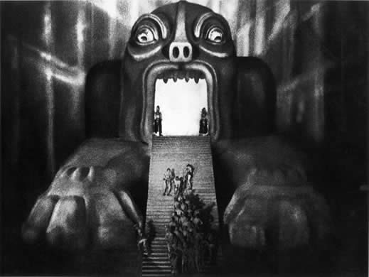
Another one of the more famous aspects of
Metropolis was its use of effects throughout the film to create vivid and threatening
mirages that Freder witnessed and became traumatised by.
Figure 3 is a film still from the main machine
featured in the workers area; when the machine blows and workers are injured
and killed, a series of film was played that showed the machine open up and the
workers fall into the pits of the mouth while the other march in unison to
their fate. The use of the buildings and the daunting face on the machine
created a sequence of film that was both disorientating and helped to convey
the message of the film. ‘when the machinery
explodes, Freder has a vision in which the machinery turns into an obscene
devouring monster.’ Ebert.
The use of height in structure is
again evident in the workers underground city, even more so to help show the
dominance that Joh Fredersen had over the city and to carry through the message
of power.
Bibliography
Images
Images
Film Still 1
(Fig 1) http://davidszondy.com/future/city/Metropolis%2001.jpg
Film Still 2
(Fig 2) http://metropolis1927.com/inc/img/gallery/stills/13.jpg
Film Still 3
(Fig 3) http://www.scifiwright.com/wp-content/uploads/2011/01/metropolis01.jpg
Quotes
Robert Ebert. In:
http://www.ebertfest.com [online] At: http://www.ebertfest.com/four/metropolis_silent_rev.htm
(Accessed on 04/10/12)
Paul Brenner. In: http://movies.amctv.com
[online] At: http://movies.amctv.com/movie/1927/Metropolis
(Accessed on 05/10/12)
Robert Ebert. In: http://www.ebertfest.com/ [online] At: http://www.ebertfest.com/four/metropolis_silent_rev.htm
(Accessed on 05/10/12)
Subscribe to:
Posts (Atom)