Showing posts with label Cinematic Spaces Film Reviews. Show all posts

Thursday, 25 October 2012

Cinematic Spaces Film Review: Alien (1979)


Alien (1979) was directed by Ridley Scott and had art influences throughout the film from Hans Rudolph Giger, a famous artist known for his surreal ‘biomechanical’ art style which was incorporated well into Alien.
When Alien was released over in America, it came at a time when man had started to fear the power of machines due to a nuclear power plant mishap that happened months before Aliens release; the relationship between Ridley and ‘Mother’ the ships on-board AI portrayed the threat machines could have on humans and helped sell the films to the Americans, as it sparked their interest with machines and the idea that they could harm us.

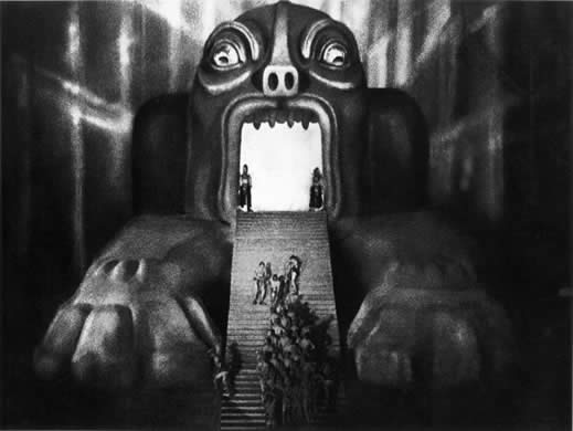
One of the most interesting and controversial areas that surround the film is Gigers artwork that was used for the designs of the main antagonist ‘Alien’ and his creation of ships and architecture; there have been numerous theories that suggest underlying sexual themes in Alien that have been portrayed through the objects and characters. Figure 1 is an image of the main antagonist, Alien, with his retractable second mouth ready to attack, this second mouth has been considered a sexual object; ‘The elongated shape of the aliens head, as well as the retractable second mouth, symbolises a penis’ (Willratwedge, Blogspot Name, 2012). There are also reviews and articles about the theme of sexual reproduction and rape that is also said to run through the film. 
Figure 1
Alien was filmed 10 years on from Barbarella, and unlike Barbarella, they managed to create a realistic looking future which, aside from technology improvements and effects, hasn’t dated the film and isn’t distinguishable to any specific decade.
The film uses a combination of Giger’s art style in the infrastructure as well as using old looking technology that has been placed into a futuristic setting; all of this helps to contribute to the feel of the surrounds and to the aesthetics. Scott didn’t put the crew on a high-tech, Star Trek type ship but instead on a commercial mining ship. It’s a mix of white, cluttered, blue-collar living quarters and grimy, wire and pipe filled corridors that adds to the dark and tense atmosphere,’ (Ben, 2012)

Figure 2
Alien spawned off many sequels that have been created over the last 20 years, however, the first Alien was filmed using sets and actual areas that the actors could interact with and use; this created a film that felt very real and showed audiences that the areas they are running around in exist. All of that helped to create a film with a very dynamic use of space and helped to put the audience right into the film as well as give it a sense of realism. 'It brings the unimaginable to life, creating a relatable fear from unknown and a sense of realism from the outlandish,(Barahona, 2011)’ This quote helps to justify the views people had in regards to the sets of Alien; considering it was made in 1979, the film was created with minimal CG, which gave the film a sense of realism that the sequels lack due to the use of CG and effects instead of sets.


Figure 3


Bibliography

Images


Quotes

Alexander Barahona. In: http://www.thatfilmguy.net [online] At: http://www.thatfilmguy.net/alien-1979/ (Accessed on: 25/10/12)


Tuesday, 23 October 2012

Cinematic Spaces Film Review: Barbarella


Barbarella (1968) was directed by Barbarella (1968) was directed by Roger Vadim; when the film was first released it was poorly received and given terrible reviews and criticisms for its flat-tone humour and simple storyline, as well as the controversial scenes and behaviour of the main character. However, over the years the film has gathered a cult following and was a bigger hit the next time it was released in 1977.


One of the more noticeable areas of Barbarella was the use of colour throughout the film, a lot of the scenes representing space or the lands in space used vivid imagery and clashing colours to create very surreal looking worlds. Instead of the common representation (an inky backdrop with twinkling stars), we are shown a formless mass of viscous goo photographically combined with sparklers and various other lighting effects.’(Pandolfi, N/A) 

Figure 1
As Pandolfi says, the film took a very interesting approach as to how they should represent and portray space; the film was widely criticised for its odd use of colours and imagery, since there was more information about space around at the time Barbarella was filmed, people were surprised by the futuristic portrayal they went with. 

Another noticeable aspect of Barbarella is the use of textures/scenery/clothing and effects were all created to make the film sci-fi and as if it is set in the distant future, but the film managed to make itself look dated by using influences of that time period (1968) such as the fur walls and flooring in Figure 2.
‘Barbarella couldn’t exist in any era but the 1960s and its delightful over-the-top qualities find an ideal expression in the ridiculous excesses of the time’ (Vaux, N/A) 


Each aspect of the film, such as the costumes or the materials used, helped to keep the film in the 1960’s due to the use of fur or trippy and drug like images through the film as shown in Figure 3. the sets are designed with gorgeously deranged excess –Barbarella’s spaceship comes with pink carpeted roofs and walls’(Scheib 1999-2012)


Figure 2
Figure 3

The film Barbarella had a unique way of portraying a futuristic space to the audience; the film used very dated materials to help give the sets a futuristic look, but this resulted in dated the film further. 

Figure 4
Figure 4 shows the Labyrinth that was explored before Barbarella moved on towards the big city which is also featured in the image; the Labyrinth is suppose to be ‘the slums’ or the outer wasteland of the city that lays further up the hill, this is where all the degenerates and strange people are sent. The Labyrinth, seemed similar to what one might imagine hell to be, where all the off cuts are placed if they're "not hole". Bodies were stuck inside the scenery, doomed to be striped of emotion, and clothes, to never move again’ (pixipui, 2010) Figure 4 shows the difference in architecture and structure for the two areas which helps to portray the difference between the rich and the poor.


Bibliography

Quotes

Chris Pandolfi. In: www.gonewiththetwins.com [Online} At: http://gonewiththetwins.com/pages/archive/barbarella.php (Accessed on: 23/10/12)


Richard Scheib. In: http://moria.co.nz [Online] At: http://moria.co.nz/sciencefiction/barbarella.htm (Accessed on: 23/10/2012)

  
images


Tuesday, 16 October 2012

Cinematic Spaces Film Reviews: King Kong (1933)


The original King Kong (1933), filmed and produced by Merian. C. Cooper, was based around the giant monster ape and his fascination with one of the main characters in the film. Later adaptations of the film have seen the relationship between the two expanded more, but the original King Kong focuses more on showing the technology that could be used at the time of filming. 
Figure 1
Figure 1 is a scene late on in the film, but shows clearly the difference in size between Kong and the cast, however, the actual size of the King Kong figure was much smaller than the actual cast members; 'Given that the Kong model was no larger than the typical action figure–Yet I’d swear it’s near impossible to tell where one ends and where the other begins.' The films ability to combine scenes together so well made the film quality that much better, but they still had to create a monstrous figure that would terrify or interest the audience due to its sheer size in comparison to the scenery and the cast members, so, much like previous films, there is a sense of scale and height being used give a sense of dominance and superiority to Kong and to increase the monstrous effect that Kong was suppose to have.


Figure 2
One of the less noticeable aspects of the film, was the use of painted backdrops and backgrounds. Figure 2 is a film still of Skull Island, where Kong is help behind the surrounding walls; however, the scene is made to look like a real life island when in fact it's been painted. 'rousing story with huge, never-seen-before visuals'(Bourne 2006), Kong wasn't just noticed for it's use of stop-animation and trick photography, although the scenes were somewhat over looked in the face of such technology, there was still appreciation for the amount of detail put into the backgrounds. 


Figure 3
Figure 3 is a demonstration of how trick photography was used during the filming of Kong. 

'King Kong is often credited as the first to use miniature rear projections to create special effects sequences. Footage of the actors was projected on a small screen, one frame at a time, behind the models as they were animated.'(Miller 2012). The purpose of using trick photography for Kong was to allow the director more freedom with camera manipulation, but to also help create a sense of scale against the actors and the figures of Kong and the dinosaurs. Height and scale is one of the aspects of Kong that was very important as it helped to carry the storyline and the theme of the film. 


Bibliography

Images
Film Still 1 (Figure 1) http://cinemasights.wordpress.com/2010/04/16/king-kong-1933/ 
Film Still 2 (Figure 2) https://blogger.googleusercontent.com/img/b/R29vZ2xl/AVvXsEhTALitjh-YR5hk3dbGwOYDsEC3hS5LX5PExkuKTxBhUAp6bmgF__KA28dhwyUDNSZ-Q7hGOt8tbpkNKfgU5ijEbgnml4vUAaPl5qtwBfFtlKwhpM7M5vDEAUigz4LqGhzg-Jcvt8cAE-41/s1600/Dawn+Wall+%232.jpg 
Film Still 3 (Figure 3) http://cdn.hometheaterforum.com/4/48/1000x500px-LL-48e4f04f_Movie_00_Title14032.jpg

Quotes
James Ewing. In: http://cinemasights.wordpress.com [online] At: http://cinemasights.wordpress.com/2010/04/16/king-kong-1933/ (Accessed on 13/10/12)

Mark Bourne. King Kong. In: www.dvdjournal.com [Online] At: http://www.dvdjournal.com/quickreviews/k/kingkong33.q.shtml (Accessed on:15/10/2012)

Frank Miller. King Kong. In: www.tcm.com [Online] At: http://www.tcm.com/tcmdb/title/2690/King-Kong/articles.html (Accessed on 15/10/12)


Friday, 5 October 2012

Cinematic Spaces Film Reviews: Metropolis


Metropolis (1927) was directed by a German man named Fritz Lang but was written by Lang and his wife, Thea Von Harbou. Metropolis is considered to be one of the most influential films in regards to special effects and the boundaries it pushed in film making; considering Metropolis was only made 7 years after Cabinet of Dr. Caligari (1920) you can see how far film making and the process behind it had come in that short space of time. Whereas previous films had used a theatrical stage as their set, which gave them limited space and gave the films a theatre look, Metropolis used bigger sets and bigger spaces to create a film that looked as if it was set in a real world scenario.
Fig 1
One of the main characteristics to notice in Metropolis is the use of height in the buildings. ‘The great city of Metropolis, with its stadiums, skyscrapers and expressways in the sky, and the subterranean worker's city, where the clock face shows 10 hours to cram another day into the work week.’ Ebert. This quote, along with the image above helps to demonstrate and show how Lang used the infrastructure of the buildings, as if to symbolise the power of industrialism and the insignificance of the workers and the ‘middle class’ citizens. The buildings used throughout the film have a sense of Classicism to them in the way they use clean edges and simplistic designs, but it is used in a way to almost squash the characters and make them seem so much smaller than they actually are. This also ties in with the broken will that is portrayed throughout the beginning of the film; since the storyline is based around social classes and the workers being forced to work obscene shifts underneath the city, the use of structure ties in with the themes and motifs well.

Fig 2

The image above is another way in which Lang used height and structure to convey the power and the dominance the ‘upper class’ had in comparison to the workers below the Earth’s surface; the building in figure 2 is the building in which Joh Fredersen overlooked the city. Metropolis, the futuristic city, is a barometer for class warfare with the effete rich enjoying creature comforts high in the sky while the beaten down workers toil in an underground dystopia of purposeless machines and skull-filled catacombs.’ Brenner, (2011).


Another one of the more famous aspects of Metropolis was its use of effects throughout the film to create vivid and threatening mirages that Freder witnessed and became traumatised by.
Figure 3 is a film still from the main machine featured in the workers area; when the machine blows and workers are injured and killed, a series of film was played that showed the machine open up and the workers fall into the pits of the mouth while the other march in unison to their fate. The use of the buildings and the daunting face on the machine created a sequence of film that was both disorientating and helped to convey the message of the film. ‘when the machinery explodes, Freder has a vision in which the machinery turns into an obscene devouring monster.’ Ebert.
The use of height in structure is again evident in the workers underground city, even more so to help show the dominance that Joh Fredersen had over the city and to carry through the message of power. 


Bibliography
Images
Film Still 1 (Fig 1) http://davidszondy.com/future/city/Metropolis%2001.jpg 

Quotes
Robert Ebert. In: http://www.ebertfest.com [online] At: http://www.ebertfest.com/four/metropolis_silent_rev.htm (Accessed on 04/10/12)
Paul Brenner. In: http://movies.amctv.com [online] At: http://movies.amctv.com/movie/1927/Metropolis (Accessed on 05/10/12)
Robert Ebert. In: http://www.ebertfest.com/ [online] At: http://www.ebertfest.com/four/metropolis_silent_rev.htm (Accessed on 05/10/12)  


Monday, 1 October 2012

Cinematic Spaces Film Reviews: The Cabinet of Dr. Caligari


The Cabinet of Dr. Caligari (1920), is considered to be one of the most influential silent horror films to be made. Directed by Robert Wiene, the film used quirky and strange settings and scenes to help create ambiance and tension throughout the film to help the audience react with the horror aspect. Although the film is in black and white, the use of different shades and intensities of light helps to create different dynamics in the scenes and helps to emphasise the different moods throughout the film.

Cagliari’s Expressionist style ultimately led to the dark shadows and sharp angles of the film noir urban crime dramas of the 1940s’ (Erikson,2010)

Fig 1
Figure 1 works well to show what Hal Erikson was saying about the sets and scenes used in the film. Wiene wanted to create a surreal yet horror related set that would help to create and carry the tension of the film and capture the audience’s attention; the use of jagged edges and sharp shading created an edgy and horror-type setting. Wiene also managed to create a set that allowed them to create some interesting camera shots, as shown in figure 1, the use of walling and shapes helps to frame certain scenes and gives the film a certain theatrical feel.

‘In particular, in many scenes, the shadows were actually painted onto the set, such that, in certain scenes, the shadows lie in direct defiance of natural lighting.’ (Merriam, 2008)

Fig 2
One of the other notable aspects of the scenes and sets used in Caligari was the odd use of shadowing that was painted onto the floors and walls of the set pieces. Much like Julia Merriam said, they were painted in a way that was in direct defiance of natural lighting; whilst the natural shadows were evident from lighting used for the film, the painted shadows never wavered or changed; they created a sense of depth to each set and exaggerated just how big the sets were to create a much more spacious and eerie looking area.

‘Verticality is rare in Cabinet; its buildings rest at steep angles, as though they are leaning. It’s streets wind and weaves in organic fashion.’ (Edwards, 2010)

Fig 3
Figure 3 shows all the aspects of the set design brought into one final image; the use of jagged shapes to create odd looking buildings and create a set that would intrigue and capture the audience’s attention whilst adding to the dynamics of the film; the use of contrasting lights to create an almost silhouetted figure stood atop the building to help build the tension and suspense of the film. It was Wiene’s unique set designs and lighting structures that create a film that is still regarded as the beginning of horror films and his influences can be seen throughout various set designs and structures. 


Review Bibliography 
Quotes:
Hal Erickson (2010). In: http://www.rottentomatoes.com [online] At: http://www.rottentomatoes.com/m/1003361-cabinet_of_dr_caligari/  (Accessed on 20/9/12)
 Julia Merriam (2008). In:  http://classic-horror.com [online] At: http://classic-horror.com/reviews/cabinet_of_dr_caligari_1920 (Accessed on 30/9/12)
Chris Edwards (2010). In:  http://silent-volume.blogspot.co.uk [online] At: http://silent-volume.blogspot.co.uk/2010/04/cabinet-of-dr-caligari-1920.html (Accessed on 30/9/12) 


Images:

Film Still 1 (Fig 1) 


Saturday, 29 September 2012

Cinematic Spaces Film Reviews: Voyage To The Moon


George Méliès, Voyage To The Moon (1902), was a film that was loosely based around two different novels:
 Jules Verne's From the Earth to the Moon (1865) and H. G. Wells' The First Men in the Moon (1901).
Although the film is in black and white and one of the fist silent films to be created; Méliès was able to create a short film based entirely on facial expressions and actions that helped to portray the storyline of this very early sci-fi, fantasy film that showed an area that had yet to be properly discovered and ventured, the moon.
Considering Voyage To The Moon was filmed at 16 frames per second and there was a limit to the effects that could be included into films, they relied much more on set design and lighting to help emphasise the focus and depth of each of the scenes and to show the scale of objects being used within the film. 

Fig 1
Laughably the "astronauts" are all dressed in street clothes on the moon, waving and then simultaneously drawing blankets over themselves as human faced stars of the Big Dipper look at them.’ (Nesbit, 2006)

The image above is a good example of the portrayal of the moon or space back in 1902. Due to the lack of scientific discoveries by this point; space was being represented by giant foliage that was bigger than humans to emphasise the strange world outside of Planet Earth, this also helped to give the set and scene more depth as the mushroom on the right hand side shows how small the characters are in comparison. John Nesbit also helps to prove the point that there was very little knowledge on space or the moon at the time, as the actors ascend to the moon in everyday clothing and wander about as though the moon has the same gravity as Earth; however, this all adds to the comedic side of the film that was probably never intended when it was created. 

'For Méliès, a theatre man, the camera simply replaced the audience. He positioned it far to one end of his studio, while the rest of the space was devoted to the floor-level stage and its various props’ (Edwards, 2009)

Fig 2
The image and the quote from Chris Edwards, both indicate at the use of set design to help with the space that Méliès could use. Méliès decided to leave the camera still instead of moving it around, which meant the set designs and the environment and space that the actors could work in had to help portray the scenes and give enough depth and scale to make everything used in the scene look the correct size. This was done by using background and foreground sets as shown in figure 2, with the taller houses behind the actors and the smaller houses at the forefront of the scene; this was done to help scale and size the actors and also the rocket, to help show the size of that prop against the actors and the rest of the set. 

‘The primitive silent landmark has more charm and originality than many modern CGI-cluttered epics.’ (Hall, 2004)


Fig 3
Méliès managed to create an iconic film in the space of 14 minutes, using props and sets and a standalone camera. This film has had a bigger impact on films then most films made in the last 10 years have, which proves it’s not the technology that makes a film great and that’s not what will make it an iconic film that will be remembered a century later.
The image above is the most iconic image from the film, when the space rocket collides with the moon and gets wedged into the moons eye; this image is the one that most people will recognise, even if they haven’t even seen the film. Méliès managed to create a classic film in 14 minutes, using only 16 frames per second and no change of camera, just sets, natural day light and actors.  


Review Bibliography
Quotes:
Chris Edwards (2009).In: http://silent-volume.blogspot.co.uk02.07.09 [online] At: http://silent-volume.blogspot.co.uk/2009/02/trip-to-moon-1902.html (Accessed on 28/9/12)

Hall P. (2004). Film Threat. In: rottentomatoes.com08.03.04 [online] At: http://www.rottentomatoes.com/m/trip_to_the_moon-1902/ (Accessed on 29/9/12)

John Nesbit. (2006). In: http://oldschoolreviews.com06 [online] At: http://oldschoolreviews.com/rev_20/trip_moon.htm (Accessed on 29/9/12)


Images:

Film Still (Fig 2)

Film Still (Fig 3)